Work
Work that speaks for itself — and the story behind it.
Every project here started with a conversation, not a design file. Here's what happened when strategy came first.
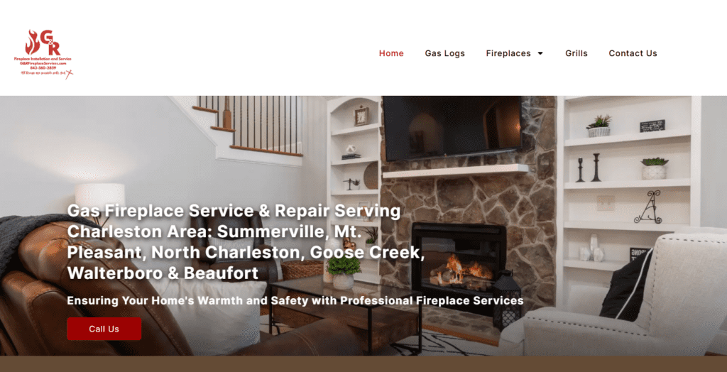
G & R Fireplace Services
Building a Local Presence From the Ground Up
The client
Rosie is a Summerville native with over eleven years in the fireplace industry — the kind of expertise that’s earned through years of hands-on work, not a certification course. When she launched G & R Fireplace Services, she knew her craft. What she didn’t have yet was a way to show up online and turn strangers into customers.
The situation
G & R was a new business with deep roots — Rosie had the experience, the local knowledge, and a clear service area across the Lowcountry. But without a website, that credibility was invisible to anyone who didn’t already know her.
She needed a digital presence that could do what word of mouth was doing in person: build trust quickly and give people a clear reason to call.
What I did
Before a single page was designed, I sat down and talked — about her services, her customers, and what she wanted someone to feel when they landed on her site. From there, I built a custom website structured around her core services, with on-page SEO designed to put her in front of Lowcountry homeowners searching for fireplace repair and installation. The goal wasn’t just a good-looking site. It was a site that worked.
What happened
Within 60 days of launching, G & R was already receiving form submissions from new leads — homeowners who found her through search and reached out directly through the site. For a brand-new business in a service-based trade, that kind of early traction is exactly what a well-built foundation can do.
A to Z Custom Woodworks
A Brand Identity Built as Carefully as the Work Itself
The client
A to Z Custom Woodworks does what their name says — custom, start to finish. By the time they came to me, they were already growing fast, earning a reputation for quality work and landing the kind of projects that push a business to the next level. But their brand hadn’t kept pace. For a company doing that caliber of work, that gap was starting to matter.
The situation
They weren’t starting from zero — they had momentum, clients, and a clear sense of who they were. What they needed was a brand that could walk into a room and communicate all of that before a single conversation happened. Something that felt like them: skilled, rooted in craft, and built to last.
What we did
Before anything was sketched, I spent time understanding the business — the culture, the work, the kind of clients they serve, and what sets them apart in a crowded market. The result is a brand identity anchored by a logo that earns a second look: a half saw blade housing a vintage hand planer, rendered in a deep teal that’s distinctive without being loud. The typography is strong and confident — condensed, all-caps wordmark paired with wide-spaced secondary lettering that gives the whole mark a sense of craftsmanship and permanence.
The full identity system includes color variations for every application — light backgrounds, dark backgrounds, single color — so the brand holds up consistently whether it’s on a business card, a work truck, or a jobsite sign.
What it communicates
Every element was chosen intentionally. The saw blade signals the trade immediately. The hand planer inside it says this isn’t just production work — there’s real craft here. The teal separates them visually from every brown-and-tan woodworking logo in the market. Together it says: we do custom work, and we take it seriously.
A business growing fast needed a brand that could keep up — and communicate the craftsmanship behind it before anyone said a word.
Fortner's Pro Painting
A Brand Identity That Works as Hard as They Do
The client
Fortner’s Pro Painting had the skills and the drive — they just needed a brand to match. Founded in 2015, they came to me ready to build something that looked as professional as the work they were putting out.
The situation
They knew what they wanted to feel: established, trustworthy, and a step above the competition. They came in with a clear sense of their colors and the overall direction — my job was to take that instinct and turn it into something cohesive and lasting.
What I did
Working from their vision, I built a full identity system anchored by a primary logo mark that earns its keep on every surface — a stylized “F” letterform whose negative space forms a paint brush, keeping the mark instantly tied to the trade without being literal about it. The navy and teal palette gives the brand weight and credibility, while the condensed typography and badge variations give it versatility across signage, vehicles, and print.
The full system includes multiple logo variations — primary, badge, and alternate colorways — so the brand holds up consistently whether it’s on a work truck, a business card, or a job estimate.
What it communicates
This is a brand that says we’ve been at this for a while and we do it right. The “Est. 2015” badge treatment adds a sense of permanence. The craft in the mark itself signals attention to detail — which is exactly what a painting client is hiring for.
They knew what they wanted to feel. The work just needed to show it.